Using good design to keep children and young people at the centre
Ida Henrich outlines Horizons approach working with South Ayrshire Children’s Services learning partnership
“Several young people that I spoke to at an event last week said it felt like it was made for them rather than for adults which I really liked!”
Gillian Carroll, South Ayrshire Children’s Services
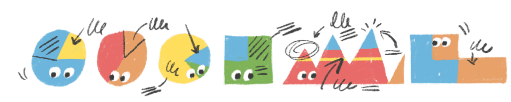
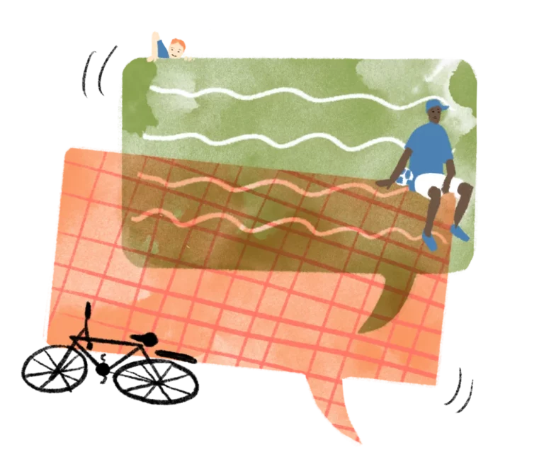
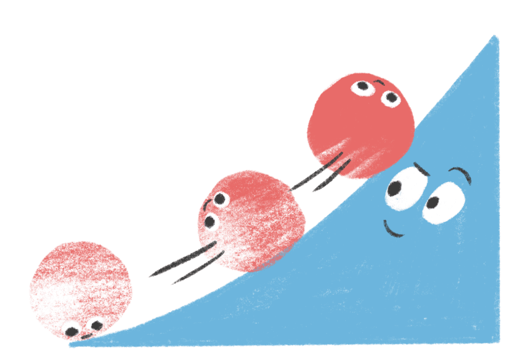
Illustrations as a diving board
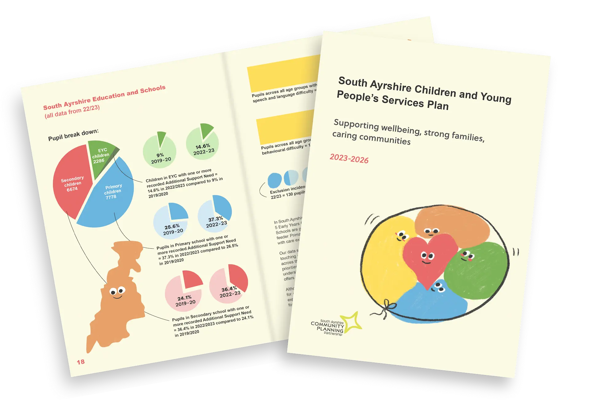
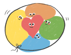
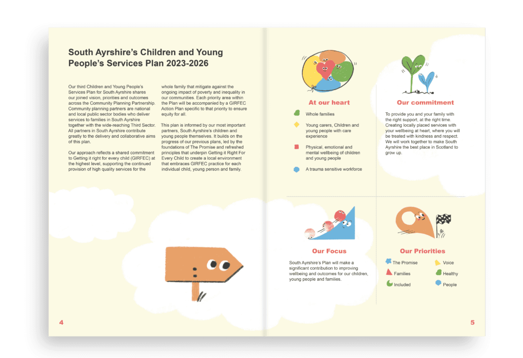
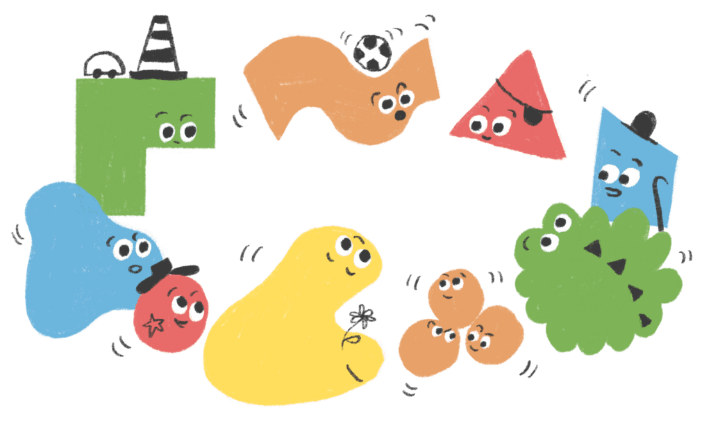
For the South Ayrshire Children’s Services learning partnership branding, we wanted to bring the energy and flair of infants, children and young people into their Children’s Plan to help bring their voice into the council’s plans.
Colourful characters bounce through the pages and guide the reader through the statistics and strategic goals. The element of surprise is a powerful tool for highlighting important key messages and the tone of the paper. I work with clients and the research teams to develop and refine what we are communicating through the visuals. An intriguing layout can act as another diving board into the message and a starting point for important conversations.
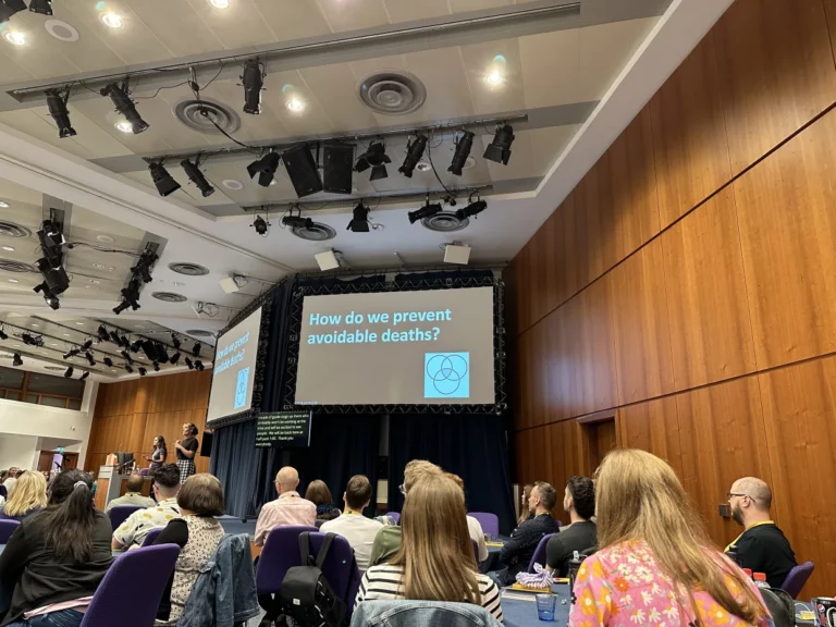
Does design make a difference?
At Horizons Research we have noticed increased engagement with the research and learning process when invitations, flyers and websites are designed with a consistent and bespoke identity. Gillian Carroll from South Ayrshire Children’s Services has said:
“I found the artwork to bring to life a sense of journey and brought a flow to the plan that could not have been created without such fun, engaging and clever artwork. The feedback I have had so far is that the artwork makes the plan stand out from our council plans in a really positive way, as it is engaging and the artwork makes it easier to digest/understand the work.”
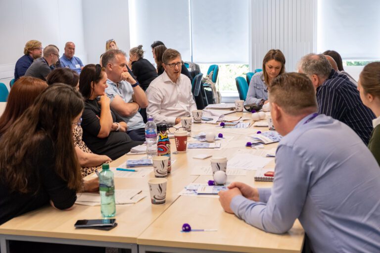
When does design get involved?
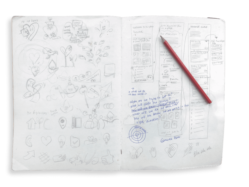
From the start of a learning partnership to develop a ‘look’ and at the finish line of any paper, website or workshop materials. The design process is often the last stop, after a long process of research and development, before the findings are released to the public.
Accessibility
While designing the research data graphics, I went through two stages of proofing. First, we need to make sure that any graphics are accurate representations of data. Secondly, to make the data as accessible as possible. We paid close attention to colour blindness in the design process.
As a dyslexic designer, I care about people who don’t find reading long and dense pages of text easy and natural. I believe that good design, good layout and chunking of information can help everybody have a more enjoyable reading experience.